_______________________________________________
Hey guys! I haven't posted about my Project Life pages since this post back on April 2nd and since I've been on a Project Life kick lately I'm even more motivated to share my most recent pages. I've been looking at a lot of different people's pages and getting lots of ideas.
Sometimes when you do this kind of project it's easy to use your old stand-by techniques without a second thought but I was relying more and more on just adding extra elements in the photo editor instead of actual embellishment. That's fine and all (especially if you're doing digital pages!) but my aim wasn't to do digital pages. It was a bit silly just to do everything digitally, print them out, cut them up, put them in pockets with the occasional embellishment. It is time for me to shake things up a bit in my scrapbooking.
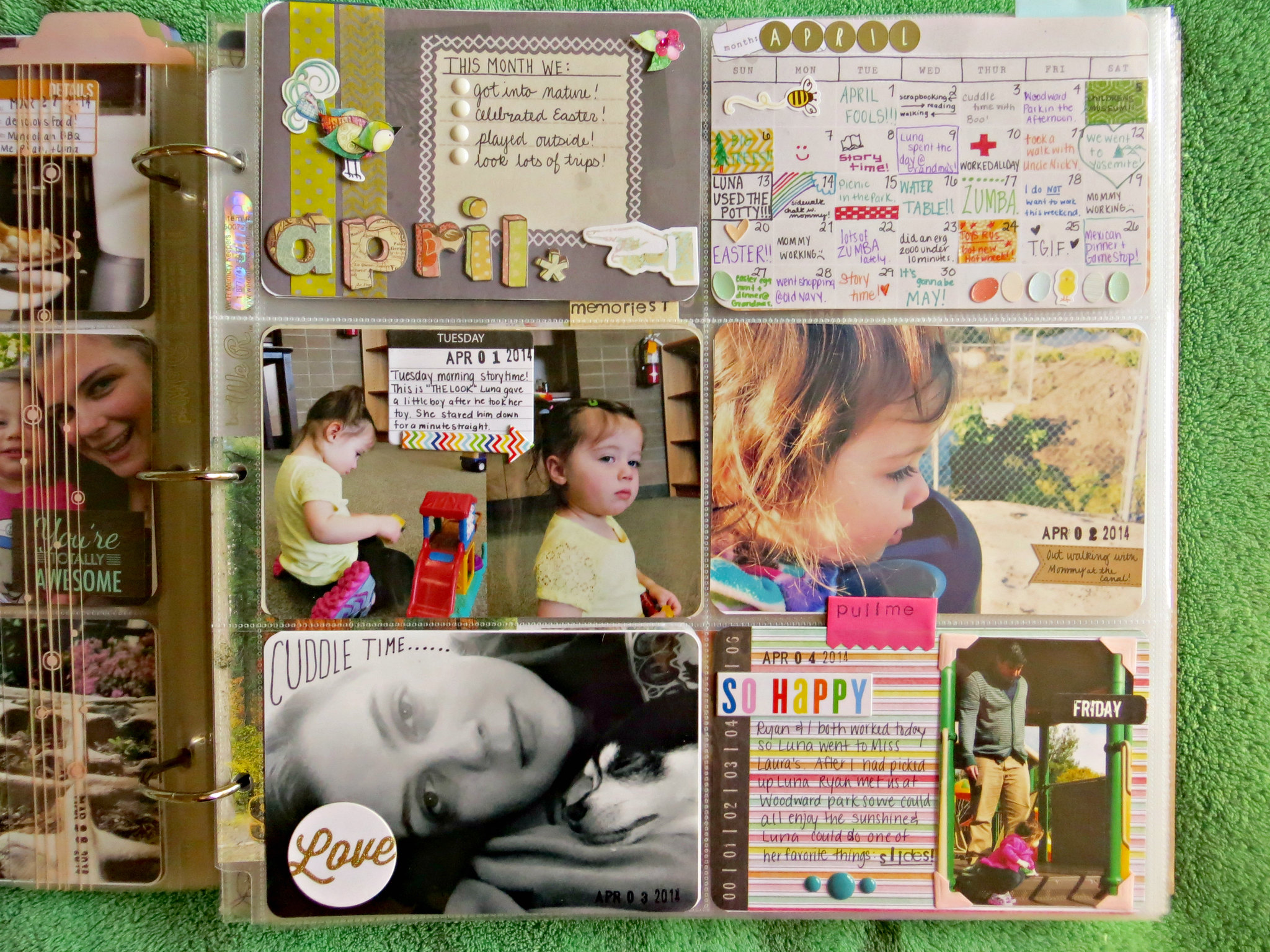
Here are my pages from April 1-6 that I just finished this past weekend:
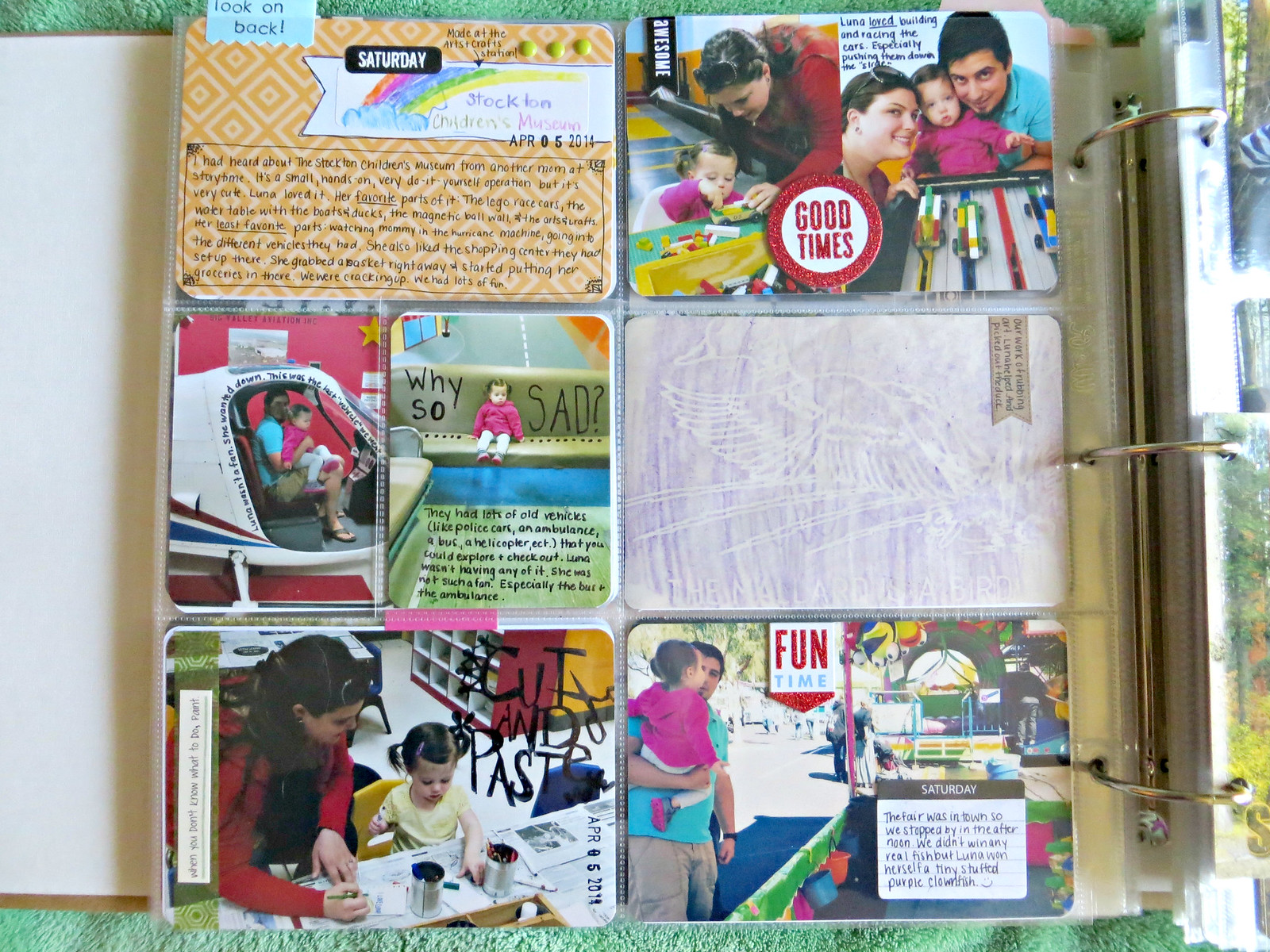
In what I'm calling my signature style of "mish-mash-anything-goes" I love this page. Lots of bright and happy and fun memories.
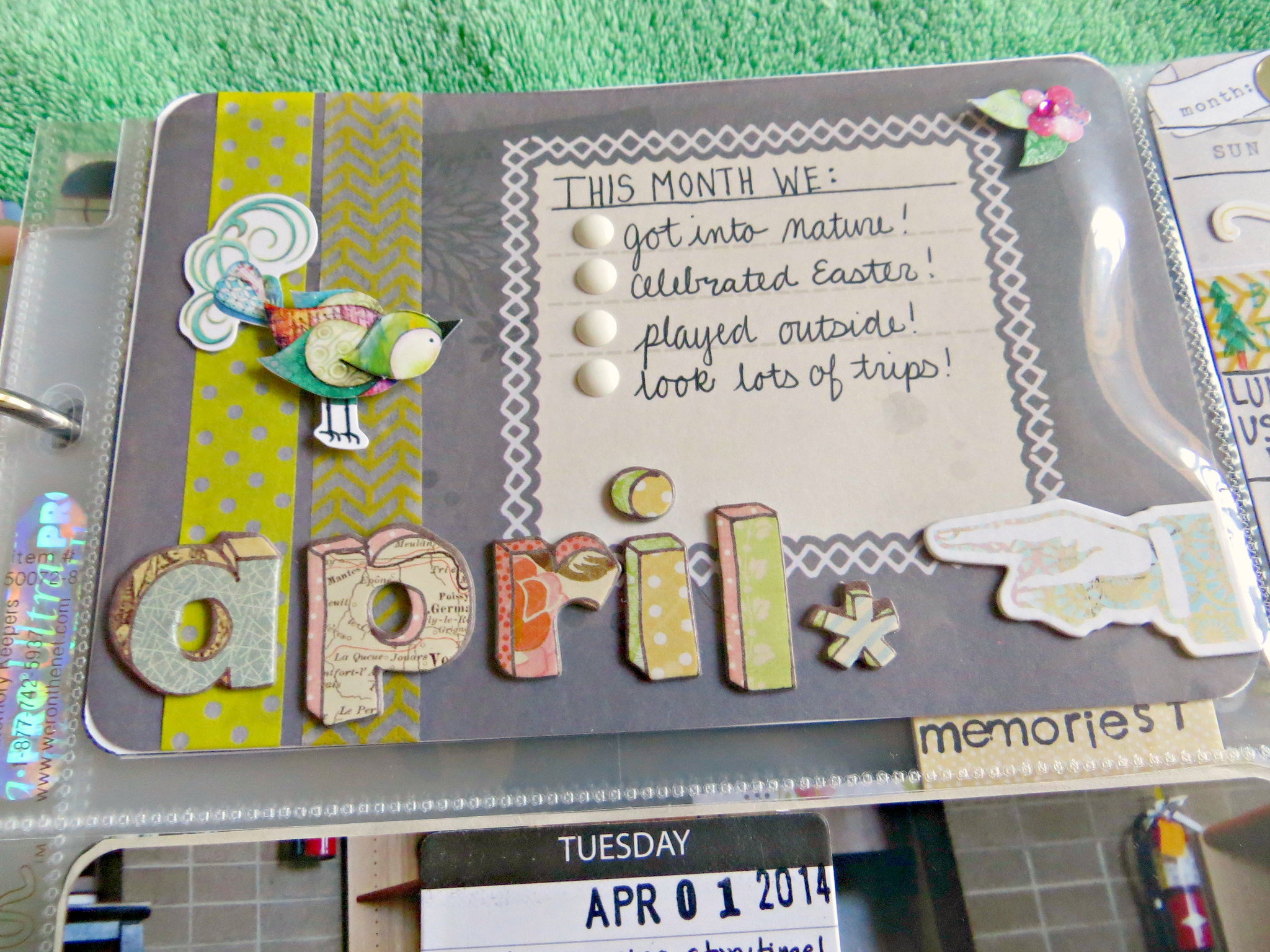
The "April" Title card was a bit more muted then I'd like and it was hard finding elements that would go together to fill up the space. Don't you just love those letters though?
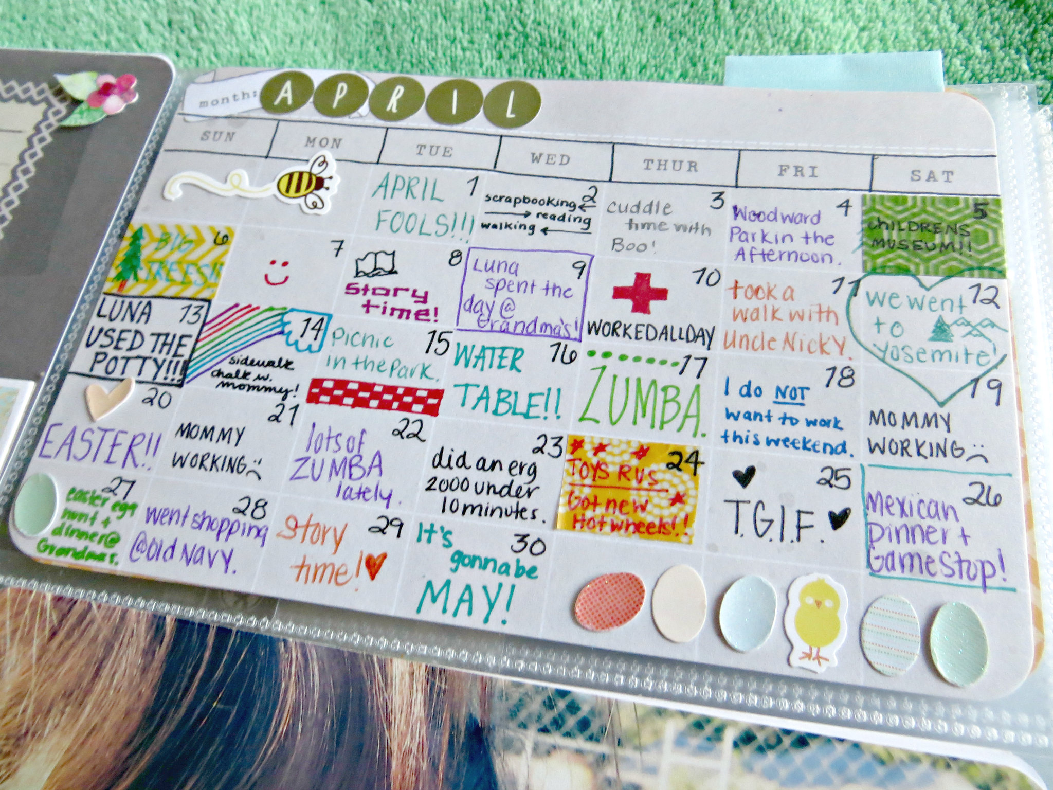
Holy moly. This calendar is probably my favorite part of the whole page! I think it'll be so neat to look back on this years from now. I didn't keep track of what we did or anything. I just kind of looked through pictures to jog my memory of what we did and for days I didn't have pictures and didn't know I just kind of filled in whatever. (i.e. "Mommy working" and "TGIF" Lol.) I think I may use one of these every month. And actually keep track of things better for it. I love it! *The card is from the 5th and Frolic Edition Core Kit by Dear Lizzy. I think it's a Michaels exclusive. I love this kit.*
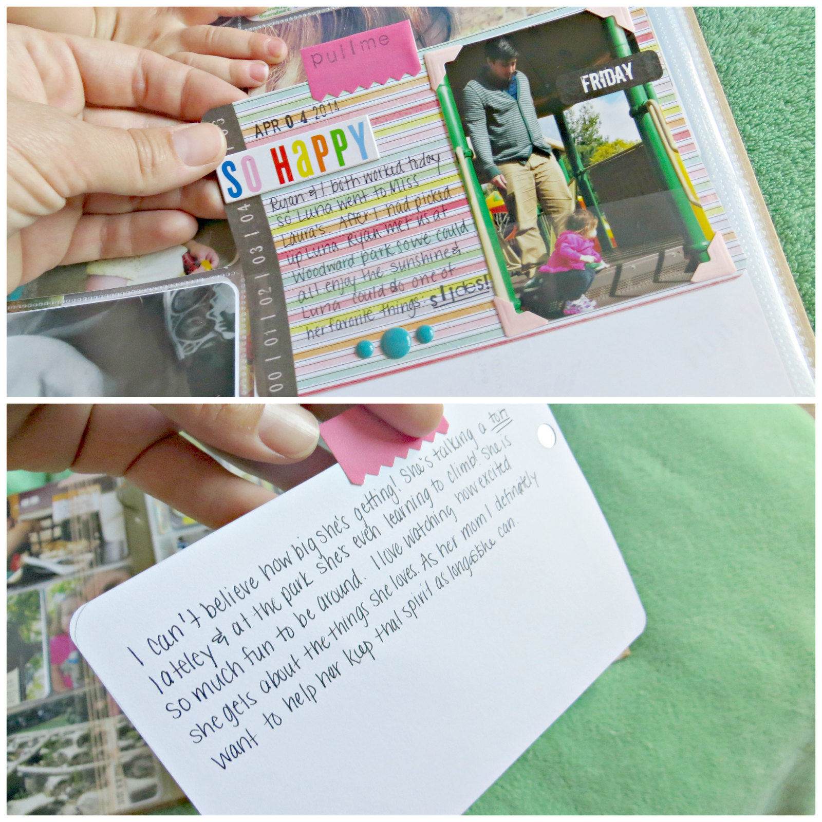
I had more journaling I wanted to do on this card so a little pull tab worked perfect. I love including some hands-on elements too. I think it's neat!
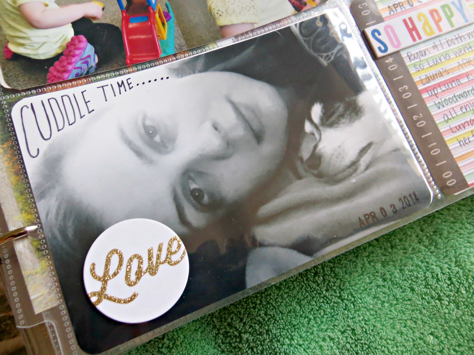
Before if I wanted to jazz a picture up with some text I would do it in the photo editor but I'm trying a bit more to use handwriting on my pictures. I definitely need a better pen for this but I like the way it turns out. And yes, that's me and little Boo Radley cuddling in bed. (Cell phone pic quality for sure. But thank goodness for cell phones because if not, I'd have a lot less pictures.)
This page was kind of "eh" in my book. But the memories are documented and that's all that matters, right?
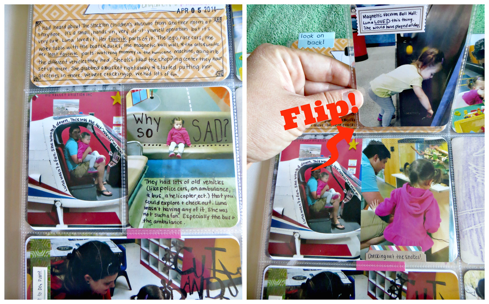
Here's the neat part though! I came across this Flip Flap pages by Close to My Heart somewhere on the internet and I knew I just had to have them. They have all sorts of different sizes and there's an adhesive strip on one side to attach them right to your PL pages and you have a fun little way to add extra pictures or journal. You can even layer them for a little mini album within your album. Ahh! The possibilities! (This is perfect if you have one to two more pictures you want to add to a layout but not enough to justify adding another whole insert. Plus, it's a fun hands-on element!)
And moving on....our day trip to Big Trees State Park!
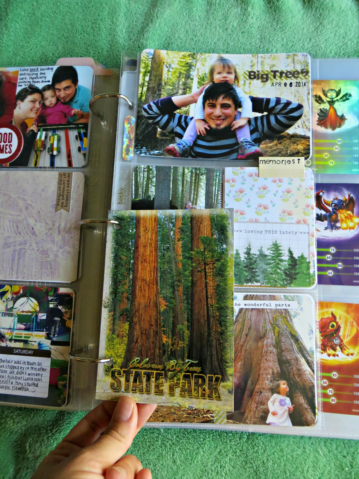
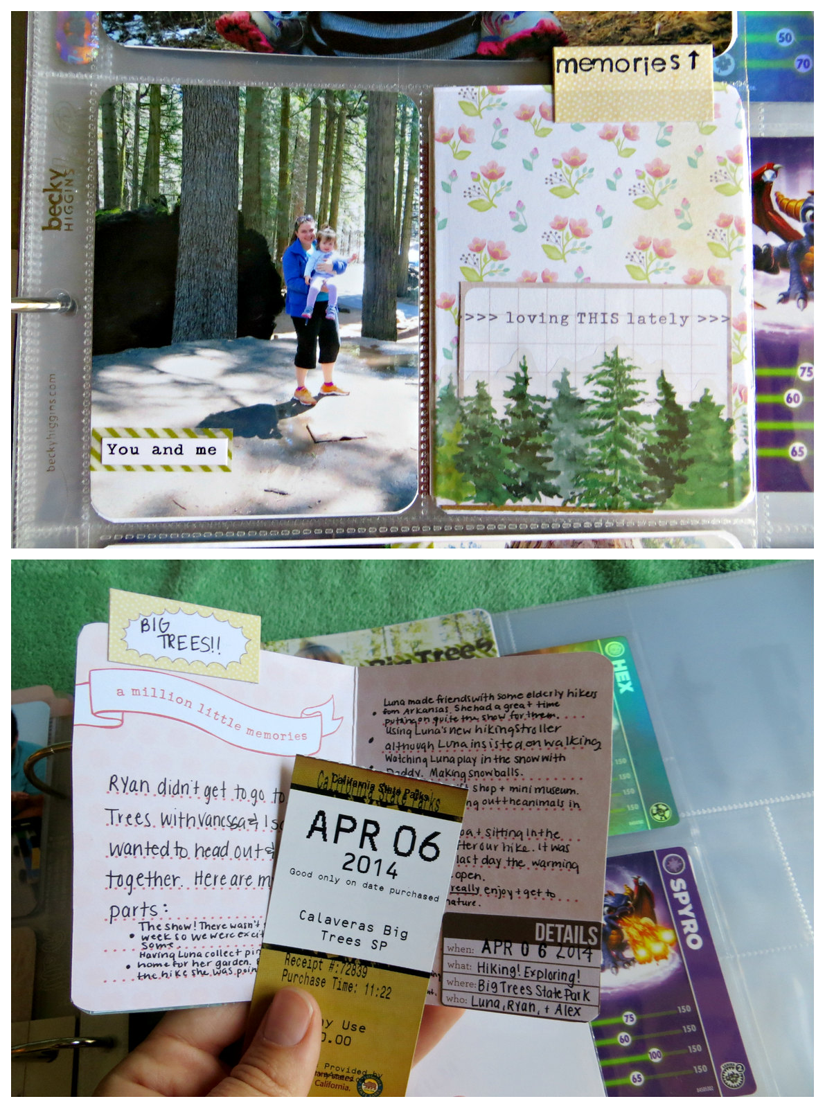
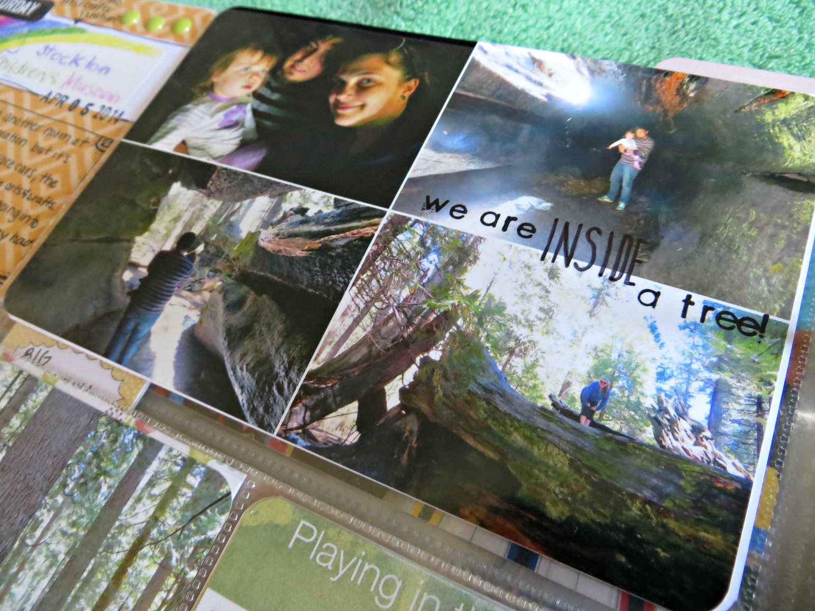
I used a Becky Higgins Design H Insert for our Big Trees State Park pictures. We didn't take a ton of pictures since we've been there a fair amount before, just not with Luna!
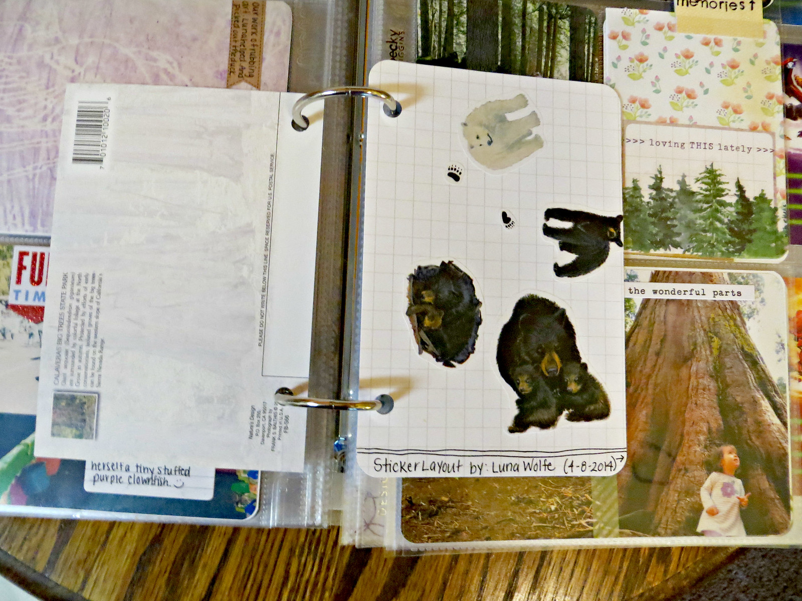
I forgot I had this too so I had to put it in. We had bought Luna a sticker book full of bear stickers at the gift shop. I needed to entertain her a couple days later and asked her to make mommy a bear card for my scrapbook. She happily obliged. This girl LOVES stickers.
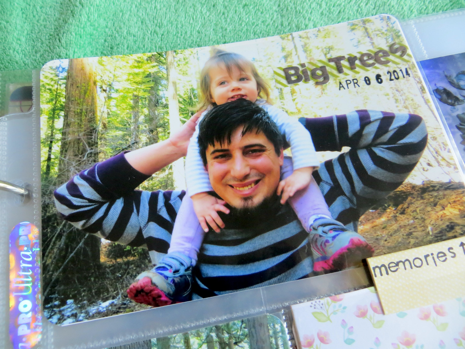
This picture didn't turn out so well since I had a lot of glare on the photo pocket but how freaking cute is that picture? I had a mini running theme for these pictures of words on stop of that clear and green striped washi tape, as well as black handwriting/stamps.
I didn't have a ton of room for journaling so I included a insert card and used lots of tiny writing. The card is from that same 5th and Frolic Becky Higgins Core Kit. I slipped in our parking pass from the day as well.
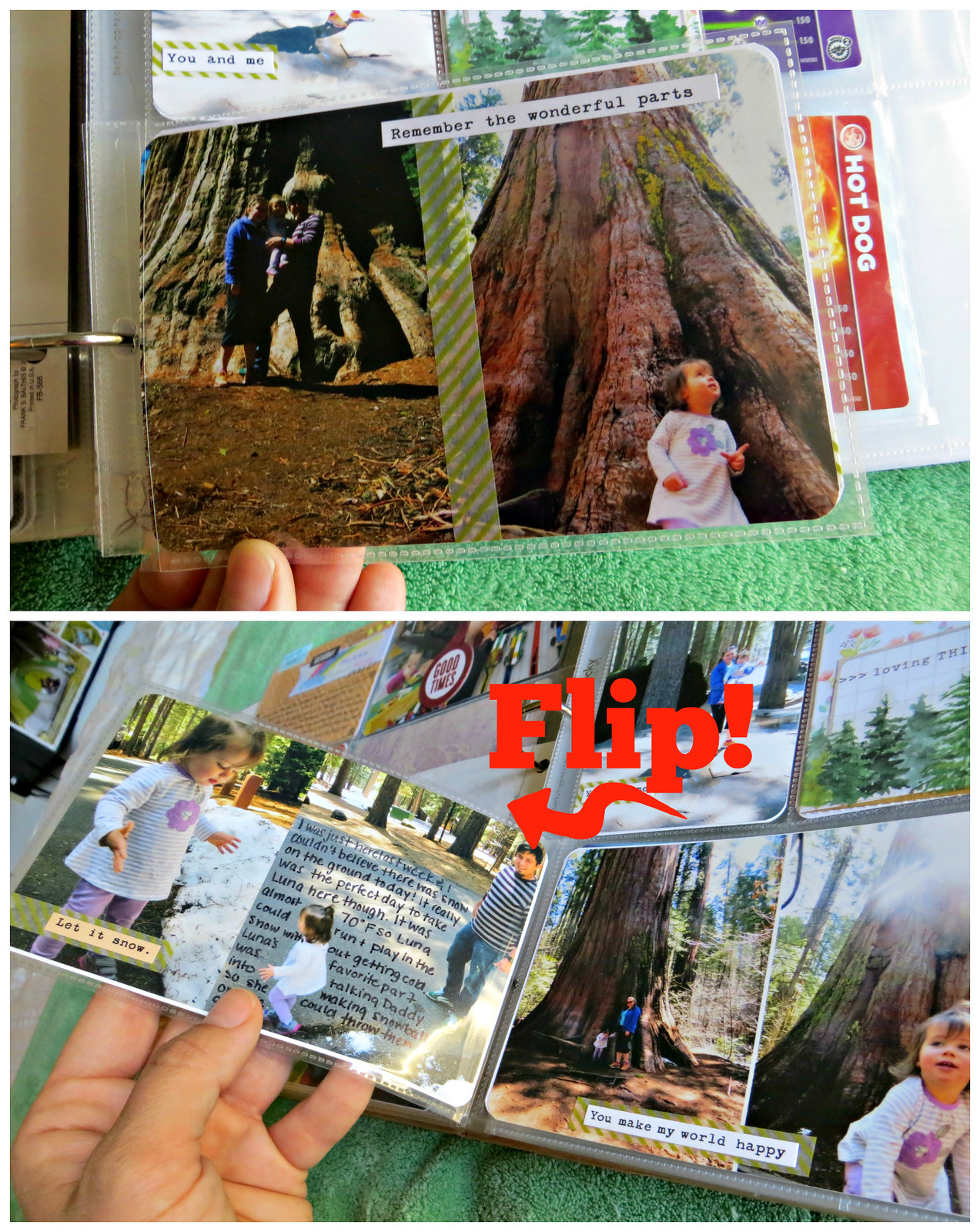
Another Flip Flap page! The typed sticker saying are from various Cosmo Cricket Tiny Text packs. I LOVE these packs. Easy cute embellishment on the cheap. I have 3-4 different sheets. I'm making it my goal to get them all. Lol. Note the journaling right on the picture. I'm liking it! I used to not want to do it. What if I'm ruining the picture, I thought. Well, it's the digital age. Print another one. Problem solved.
I forgot to take a picture of the whole back of the insert but this is in the top spot. A mini collage of us and the HUGE trees. I used a combo of letter stamps using Staz On ink (a new favorite!) and handwriting for the embellishing.
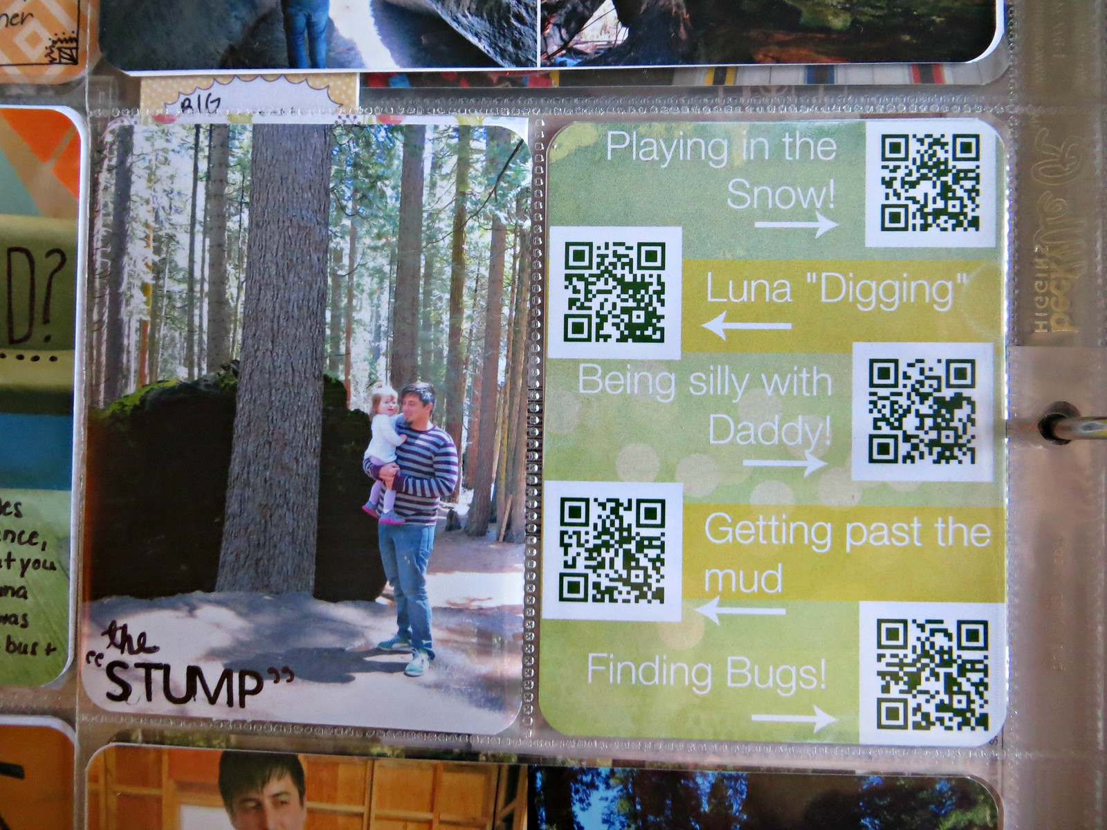
A new favorite!!! QR video codes!! I've thought about doing this for a while but I couldn't help but thinking that it was a bit silly. QR codes haven't caught on much and in twenty years will I even be able to scan them? What will the next technology be? Then I figured it can't hurt if it's not around anymore or something happens to the links. It's pretty neat for right now.
I was sold on the QR video codes once I was reading someone's blog this past week that their 4 year old loved looking through the PL books and her favorite part was scanning the QR codes and watching all the home videos. I think I should still be able to scan them in a couple years and I'm pretty sure Luna will get a really big kick out of it. (And so will I!) Expect more QR codes in the future!
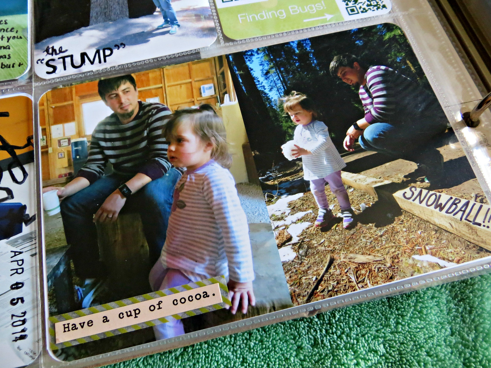
The last picture of the insert. Luna and Ryan at the warming hut after our hike, having some hot chocolate (Luna's first taste!) and Luna playing in the snow.
That's it for now! What I've learned on these pages: I love journaling/writing right on the picture and I love QR codes. Expect more in the future.
Thanks for taking a look! Let me know if the comments if there's any fun little "techniques" you've come across for Project Life. I'm open to anything!
-Mrs. 246

No comments:
Post a Comment