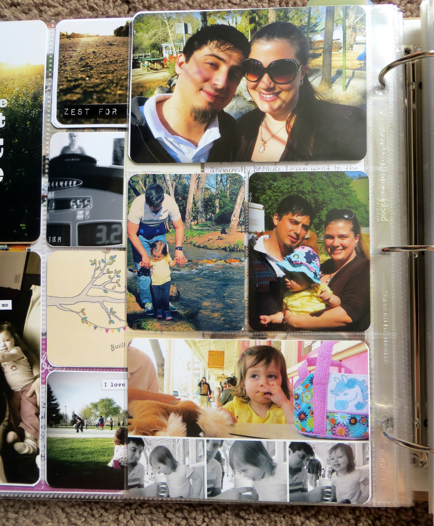
I like to focus on getting good everyday pictures in my layouts. Pictures of things that show what we're doing or just a bit of everyday life. I love when people use really nice artistic photos in their PL but I know myself and I know in the future, many years from now, I'm not going to want artistic shots. I'm going to want pictures of my life and my family doing ordinary things.
Lots of my pictures are cell phone pictures. I greatly prefer pictures taken with a camera but some busy weeks a majority of my pictures are cell phone pics. You have to carry around a lot of stuff sometimes when you have a toddler. I don't always wanna carry a camera too but I'm always going to have my phone on me.
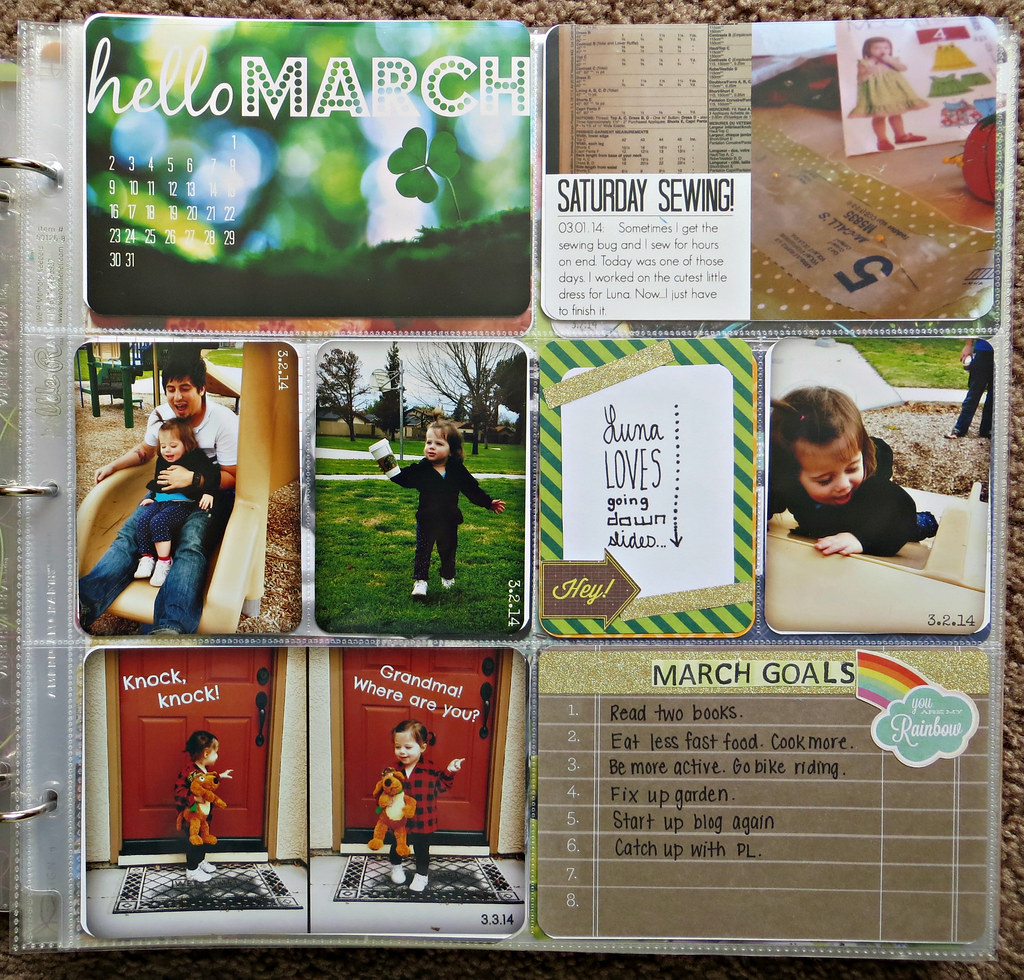
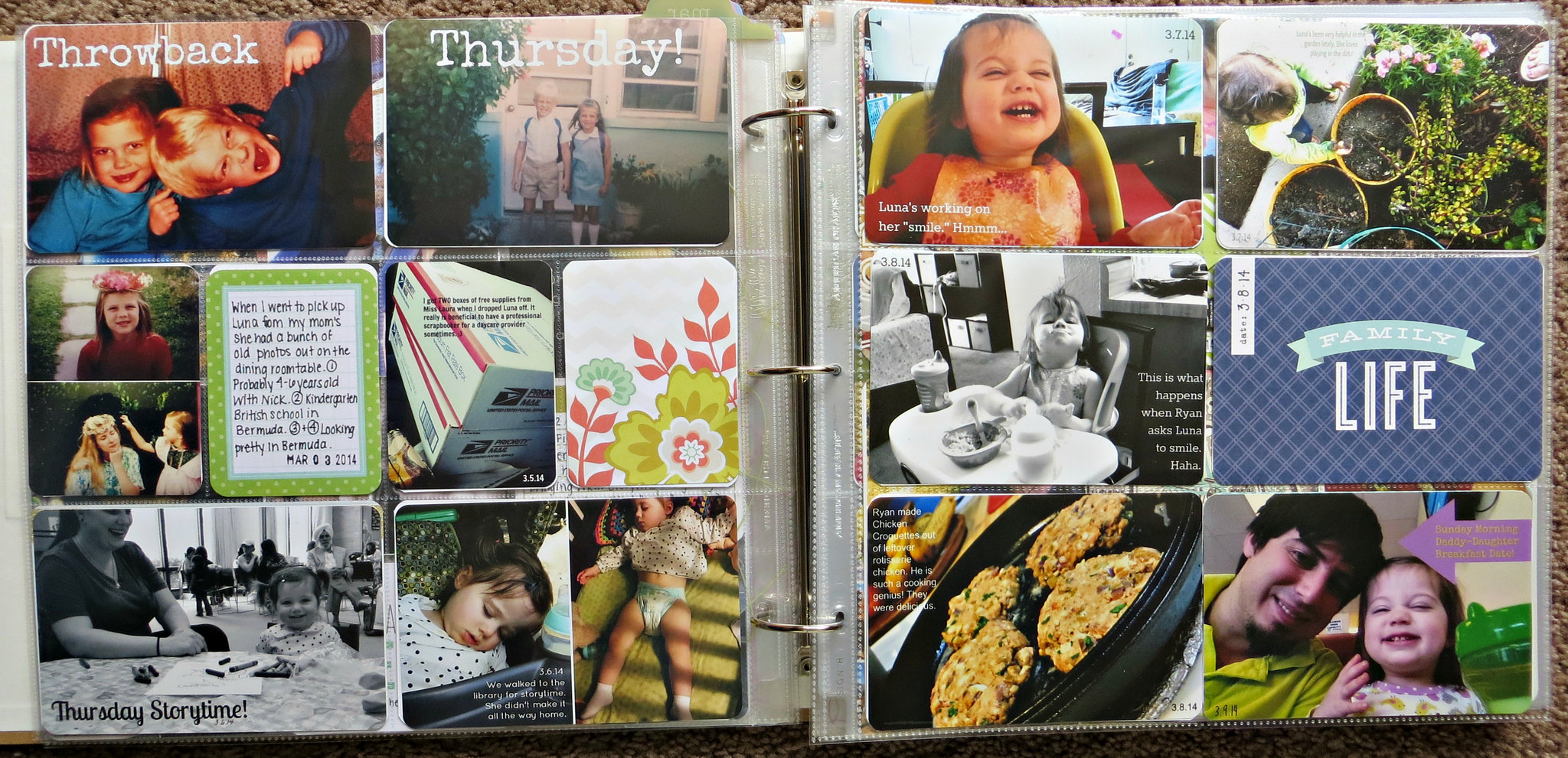
My layouts are very mish-mash. I use whatever I want but I do place pictures in chronological order. I do divide the pages up by months, but not necessarily "Week" layouts like a lot of Project Life-ers do. I would think that it would be to constraining for me personally. I already spend too much time of this form of scrapbooking that is marketed to be "easy and quick." Haha.
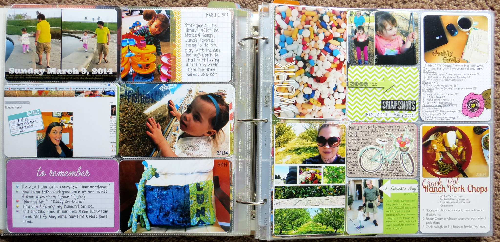
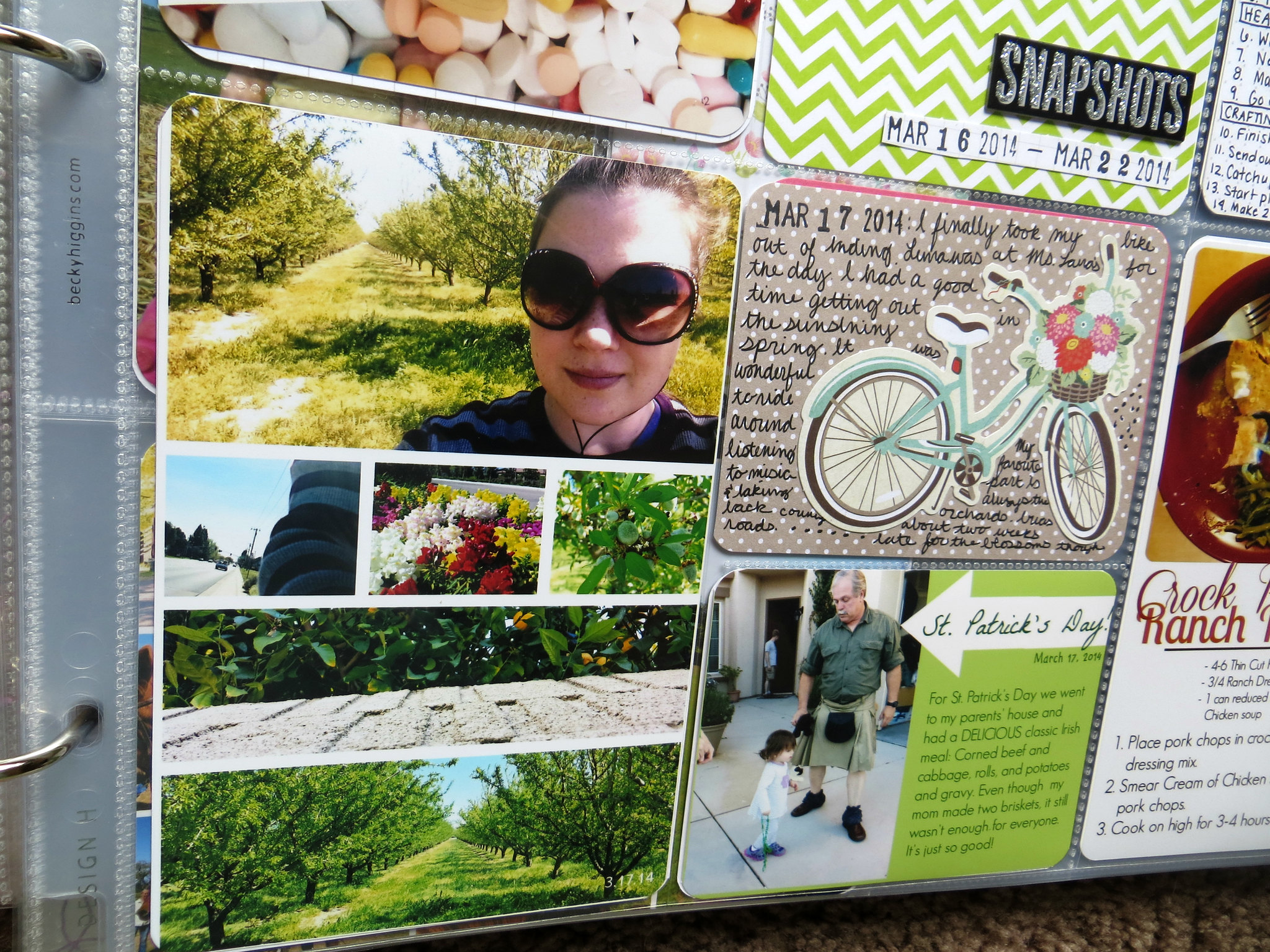
If you see in the picture below (and above) there's a "Week 12" card. This is the first time I've made one of those. I think I might start including them. Just because I don't make week layouts doesn't necessarily mean I can include week cards.
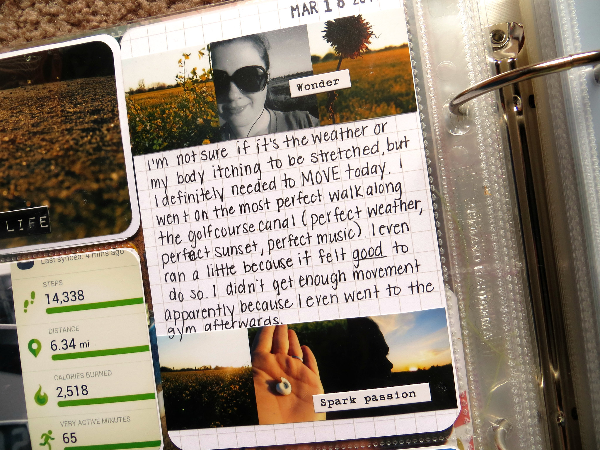
Sometimes I have a ton of pictures. (Like from my bike ride!) The best way for me to fit them all in is to make collages. I do have Photoshop and I even took a class in college, but I'll admit....I do my photo editing in PicMonkey. It's easy, it's fast. I know where things are and how to do them. It's my goal to one day learn to us PS properly but I'm not going to put that pressure on myself. Years from now I won't care what photo program I used...just the fact that I have lots of photos to look at. :)
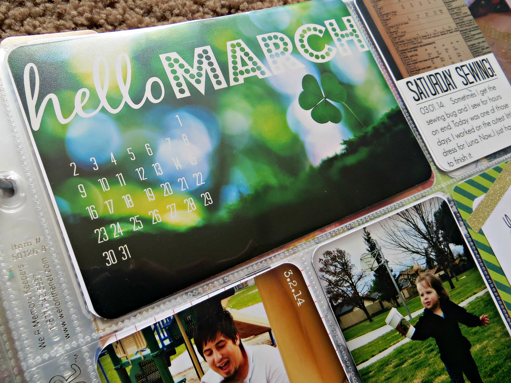
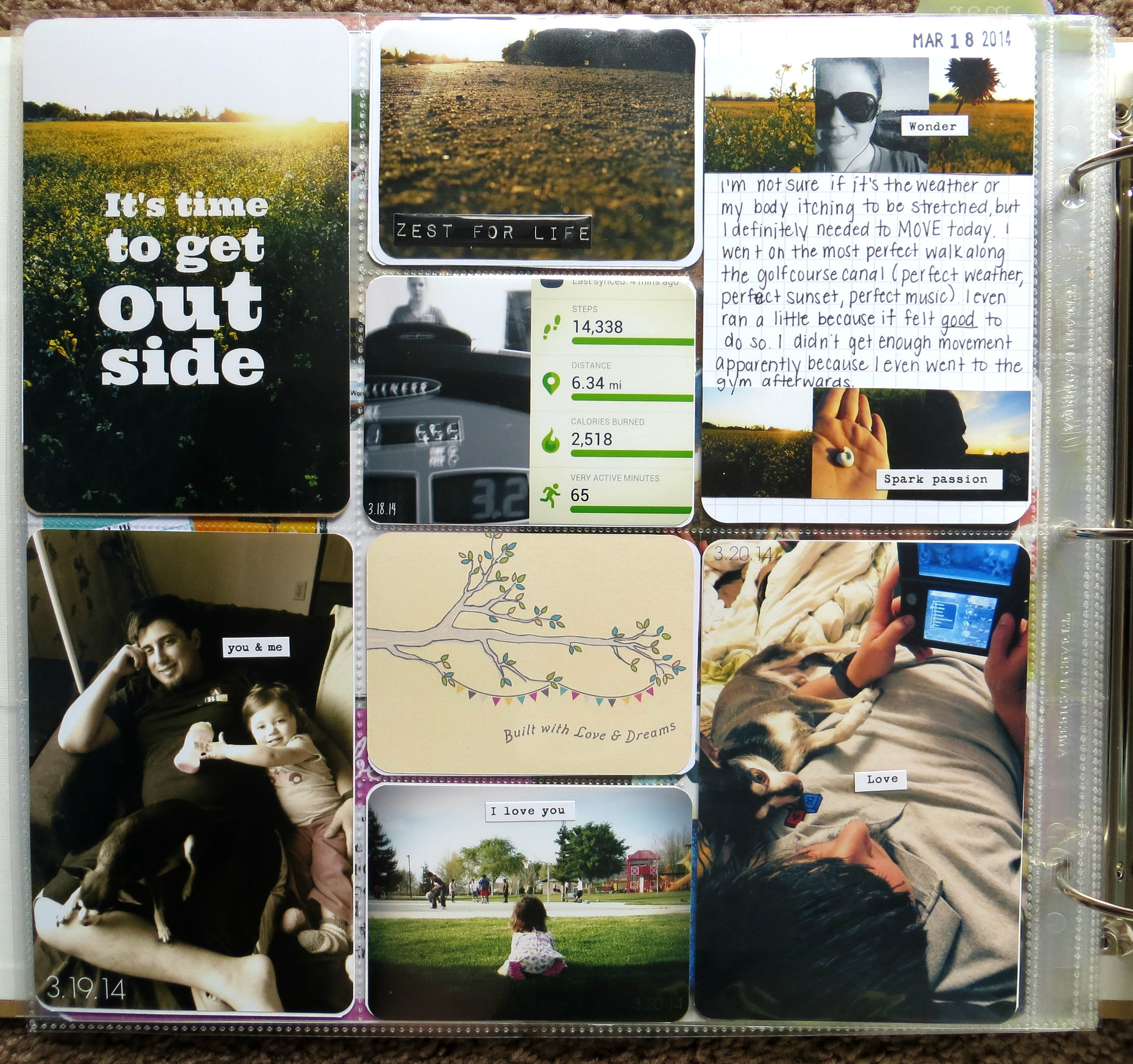
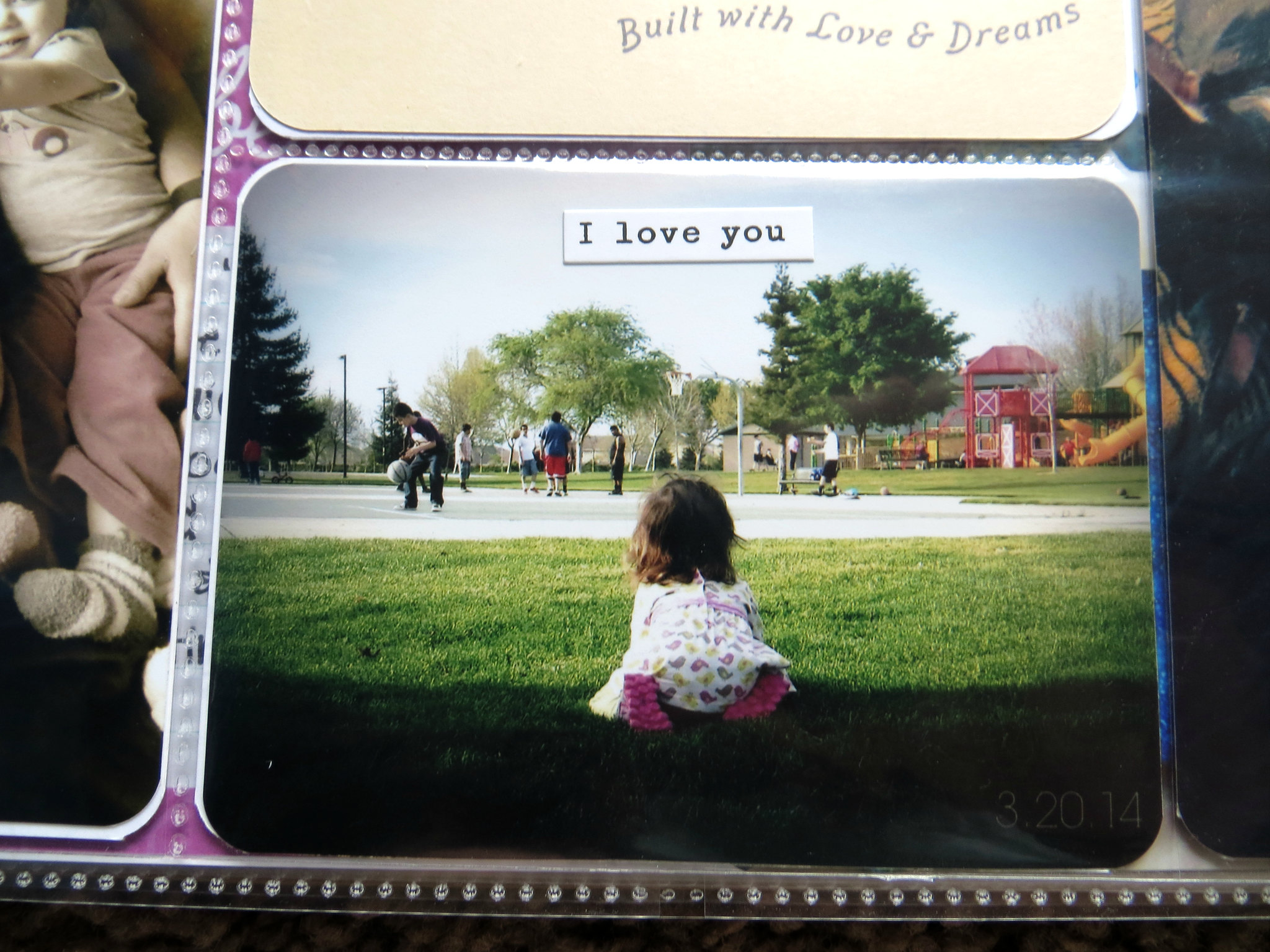
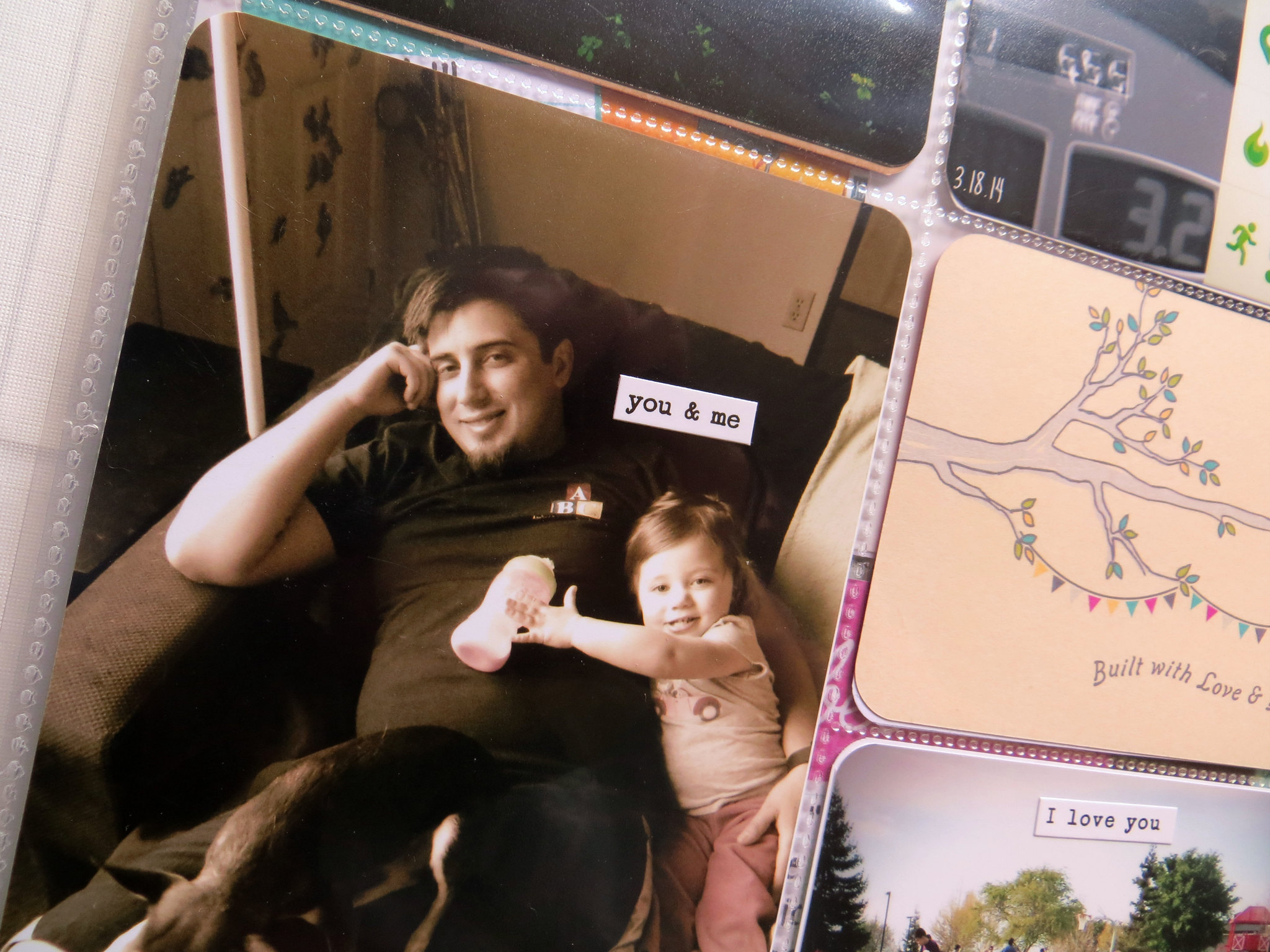
It's hard to see in some pictures, but I put the date on every picture. If one ever falls out I'll know where it goes, but truthfully, I'm excited to look back and know exactly what day that picture was taken.
I went a bit crazy with some word stickers on this page. I didn't really care for the page. I thought it needed some brightening up...it has a lot of dark plain-ish pictures. Stickers...can't go wrong with stickers.
Often I look through other blogger's pages of their fancy PL pages and I sometimes have a hint of competition. ("Gosh, I need to use more embellishments!" "I need to journal more" "I need to color coordinate and buy specified sets!") Then I remind myself that's just not going to work for me. I've always been a "throw it all together, learn as I go" crafter. I also like to pretend that my style is sometimes that of The Burrow in Harry Potter. Nice, homey, comfortable...but not necessarily as nice and fancy as other people's styles. Not that mine is any "less," just different. :)
For example, like above, I could have re-written the whole card because I messed up writing but I tell myself that years from now it won't really matter. I want my things to look like I made them. Like a human made them.
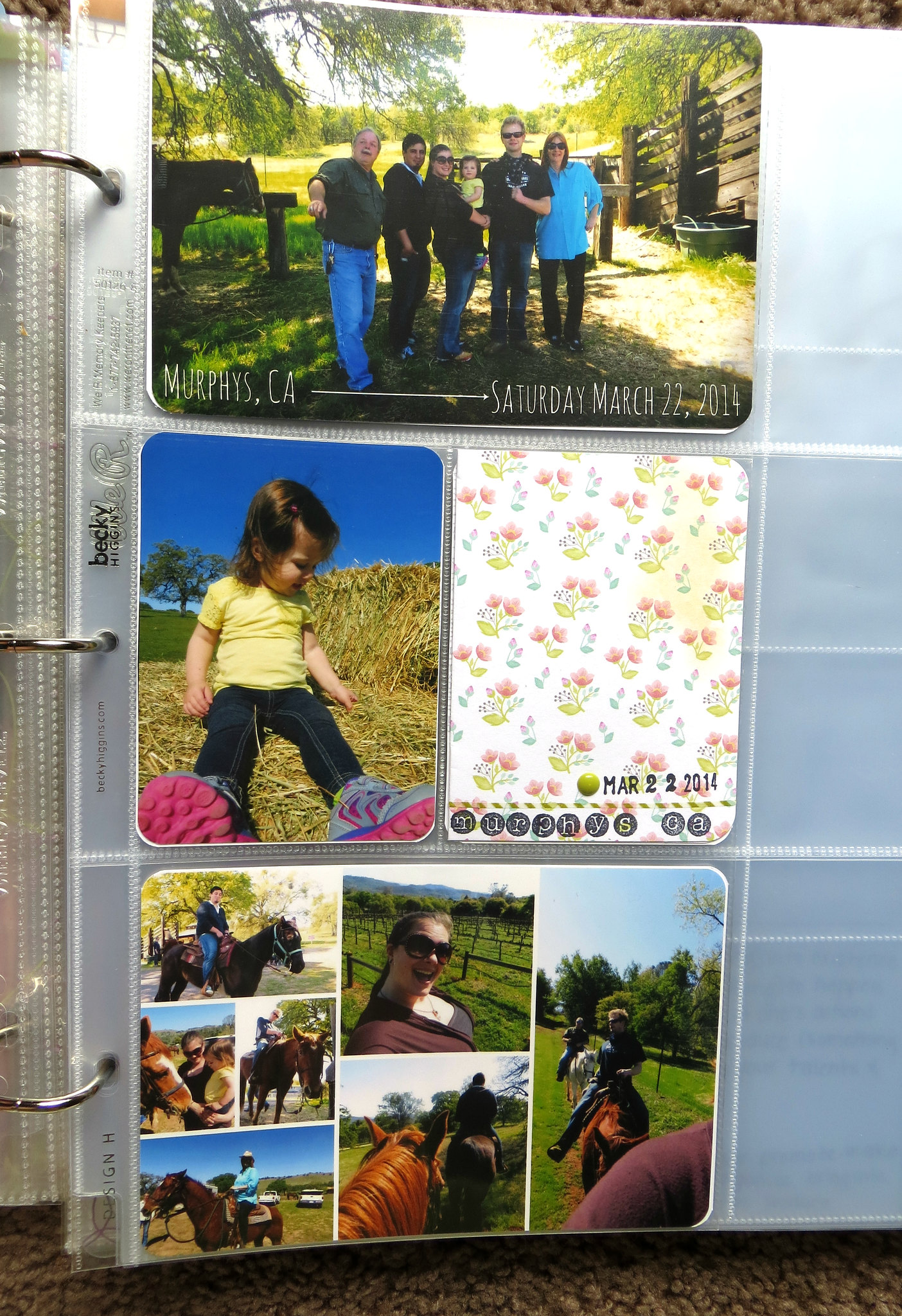
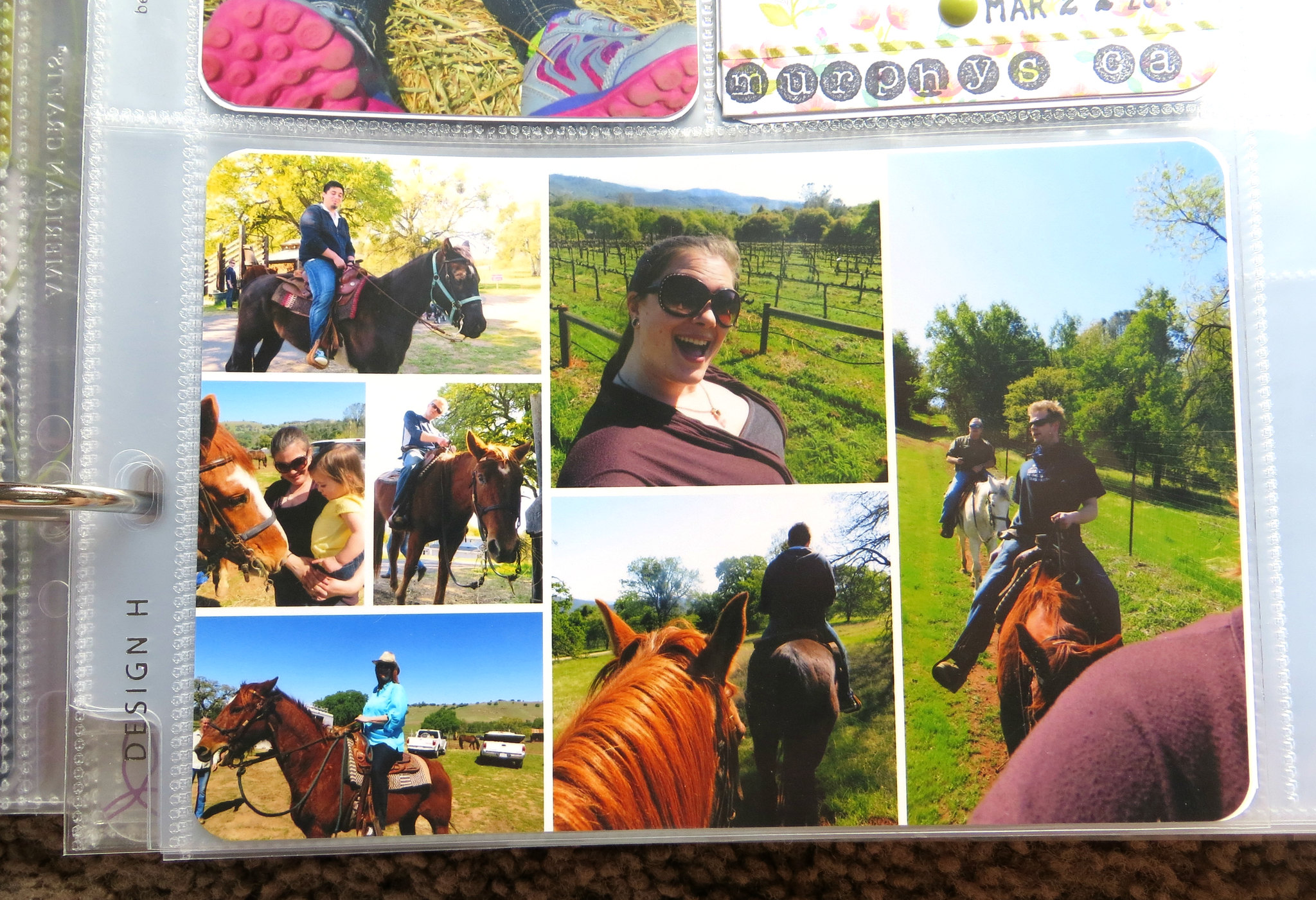
Occasionally, I'll use inserts for a special occasion. We went horseback riding through the vineyards a week or so ago. We had an awesome time. Every time I started taking "selfies" on my horse I just started cracking up to myself. It seems like such an odd thing to do. But hey, I wanted a picture of me on a horse dammit.
These last couple pictures the sun didn't want to cooperate with my photographing Project Life anymore so sorry for the glare. (Photographing Project Life is one of the hardest things to do, I swear. Does anyone else have this issue? I've read articles and tried their tips...it's just never that awesome. Except for taking all the pictures out and meticulously laying them in the same spots on top of the page protectors for photos, but let's be real...ain't nobody got time for that. Well, some people might, but I sure don't.)
So, there you go! Most of March's Project Life and a bunch of me rambling in between. I hope you enjoyed it.
Has anyone else finished some Project Life pages recently? Feel free to leave you links in the comments. I'd love to check them out!
-Mrs. 246

Awesome! I love all the green on that first page! And I agree, I want my things to be obviously made by a human too:) Also, your handwriting is gorgeous!
ReplyDelete